Print a Digital Checklist at Home (Letter Paper Tips)
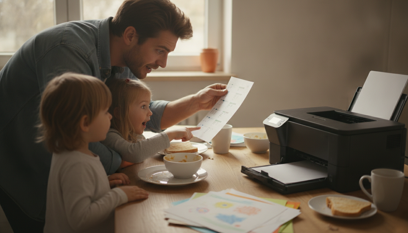
How do I print a digital checklist at home so it looks good on standard paper?
A digital checklist can look surprisingly polished on plain 8.5″ x 11″ paper with a few quick settings tweaks. Start by downloading the checklist file to your device (instead of printing from a preview screen), then open it in a reliable viewer like Adobe Acrobat for PDFs or your system’s default print dialog for images.
1) Set the right paper size and orientation
In the print window, choose Letter (8.5″ x 11″) and confirm whether the checklist is designed for Portrait or Landscape. If orientation is wrong, text can shrink or get pushed off the page.
2) Use “Fit” (not “Actual Size”) when margins are tight
If the design runs close to the edge, select Fit to Page (or “Scale to fit”). “Actual size” can clip borders or side columns. If the checklist has a lot of white space already, “Actual size” can look cleaner—do a quick test print of page one.
3) Turn on better print quality settings
In printer properties, choose a higher quality mode such as Best or High, and select the correct paper type (plain paper is fine, but avoid “draft”). If the checklist is black-and-white, printing in Grayscale often makes text crisper and reduces muddy colors.
4) Prevent blurry text from screenshots
Avoid printing from a screenshot whenever possible—screenshots can look soft when scaled. Use the original file download link, or export the checklist as a PDF at full resolution before printing.
5) Run a quick alignment check
Before printing multiple copies, print one page and look for cut-off edges, tiny fonts, or faint lines. Adjust scale (for example, 97–100%), and reprint until boxes and headings look balanced.
For a ready-to-use option and formatting guidance, see the full checklist resource here: https://spiritine.com/guide-sarcastic-genius-checklist-printable-digital-get-stuff-done/.
FAQ
What paper should I use for printing checklists?
Standard 20 lb letter paper works well for everyday use, but 24 lb or 28 lb paper feels sturdier and reduces ink show-through. If you plan to reuse the checklist, consider printing on heavier paper or placing it in a sheet protector.
















Leave a comment